Accessure
2nd Place Designathon Winner for TWG Problem statement to increase the accessibility of public transportation, and connect those with accessibility needs to existing resources that can assist them in the GTA
Role:
Lead UX/Product Designer
Duration:
3 Days
Tools:
Figma
Team:
Me, Shannon Chakma, Luis Bucio, Boming Zhou
Background
For the McMaster Design League Designathon my team was assigned the TWG, a Deloitte Business Problem Statement: How might we increase the accessibility of public transportation, and connect those with accessibility needs to existing resources that can assist them in the GTA (Grand Toronto Area)? Day one was the opening ceremony and team formation, day two was working on the solution, and day three was presenting our work to the panel of judges. After sleepless nights my team was successful in getting 2nd place for the TWG, a Deloitte Business Problem Statement
Solution:
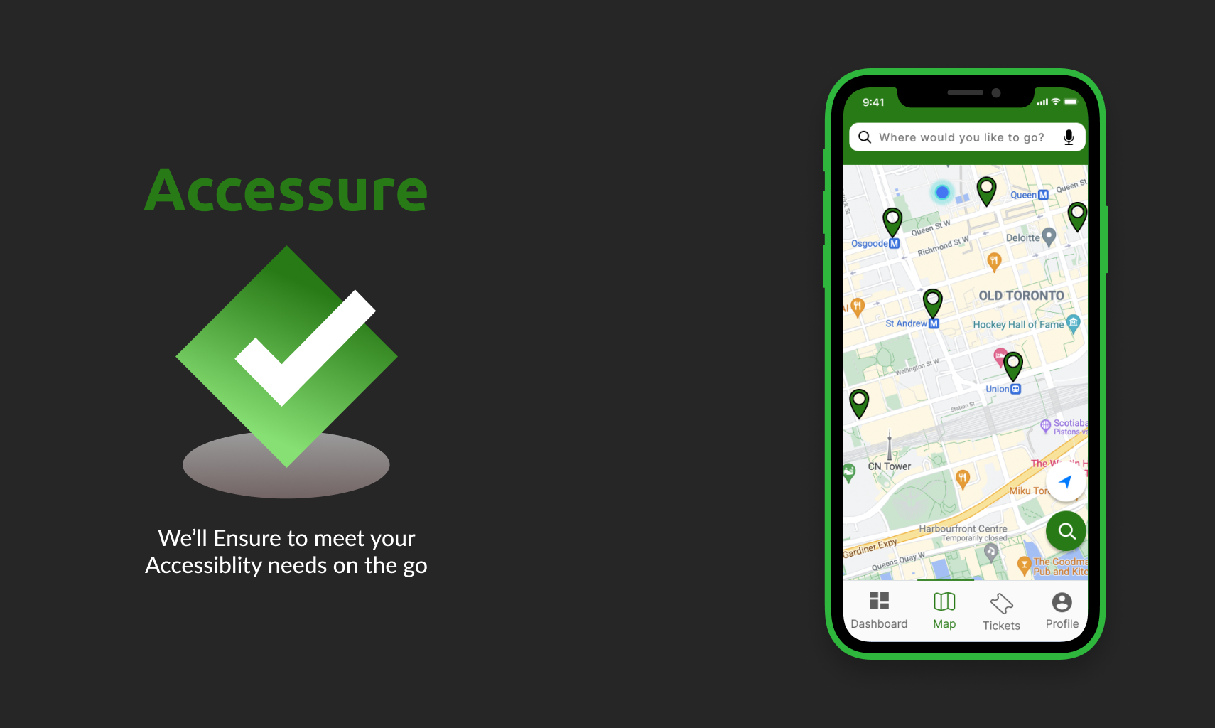
An map application that’s optimizes itself to meet accessibility needs by adjusting its design and provides users with the information they need to enable them to perform certain tasks with ease.
Problem:
How might we increase the accessibility of public transportation, and connect those with accessibility needs to existing resources that can assist them in the GTA (Grand Toronto Area)?
Research🤔
Due to the time frame given to us and how specific the users for the app are it was impossible to be able to have user interviews to empathize properly. So as an alternative we looked at posts and articles of people from the GTA that faced issues with transportation and with accessibility that faced issues.
We also created a Stakeholder Map to see who is involved with the project, how they are connected, and who’s needs to be prioritized
Define 💭
Personas:
From our user research, we created two personas, one of Jeffery a person with Cerebral Palsy, and Nora his Caregiver Nora, to get a better understanding of the needs of users and to refer back to while making the final design solution.
We conducted a Comparative Analysis of two apps to get a better understanding of the design we were aiming for. We choose to focus on Google Maps and Rocketman. Google Maps is one of the most used mapping apps so we used it as inspiration for a baseline but wanted to distill the information and focus more on accessibility. Rocketman was another app that did a great job with its real-time updates and is a mapping app made for Canada so it helped the 3/4 members that lives outside Canada to understand their public transportation better.
Ideate 💡
From what gathered from our User Research and Defining the problem we emphasized on 3 main features:
Discovering accessible public transit routes and helping people plan their trips in advance
Real-time updates, alerts, and schedules
The ability to tell your caregivers about your route
Since we got a solid understanding of what the app would be like and function we created a User Flow to see how the user would go about to complete a core task. While making the flow, I have kept some questions in mind: what are the users' expectations? Are there too many steps to complete the task?
Final Concept 🎨
Onboarding
Based on how the user fills out the questions in the onboarding process the app will optimize its design to meet their needs. Since the user, Jeffery has cerebral palsy all elements on the app are bigger so it’s easier for him to interact with and see the information.
Dashboard
Here those with accessibility issues can get the important information that they need before they’re about to head out such as delays, maintenance, etc. This better prepares them to navigate various public transit routes with ease and plan
Tickets
Here the user can easily purchase tickets by using their Presto pass by instantly loading funds and passes with a PRESTO card with NFC (Near-field communication).
Map
Since Jeffery has difficulty moving his hands and fingers we made the search button close to the button so it is easier to tap on and instead of having to type the app asks Jeffery for his destination and use voice input so he doesn’t have to type the address out. If an accessibility issue comes up the app will update the route to accommodate his needs.
The Outcome
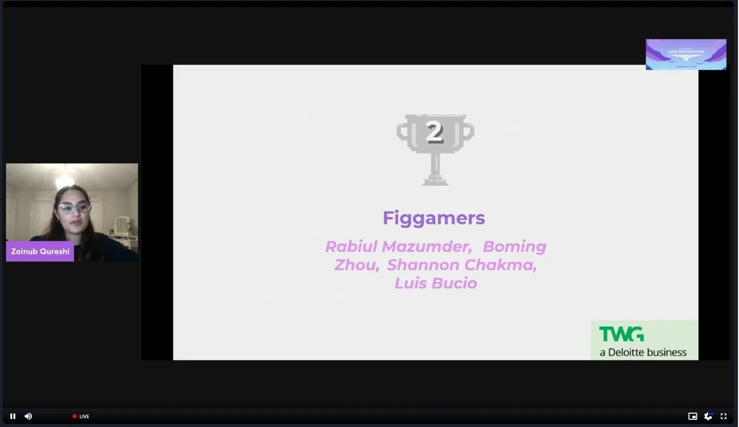
Winning 2nd place - TWG, a Deloitte Business Problem Statement
Winning 2nd place was worth the new pair of bags under my eyes : )
McMaster Design League UI/UX Designathon 2021 - Closing Ceremonies
At 8:58 is when my team, Figamers, winning 2nd place was revealed
Reflection
Since this was my first designathon there were a lot of things I had to learn from my experience. An important and crucial aspect that I was emphasizing with my team was our timeframe and managing the time we had. The designathon was 3 days but we truly had one day to have everything completed and there were Submission Guidelines we had to follow. If we didn’t manage our time well then we’d struggle to finish creating a final prototype and have a meaningful solution. So setting up a timer for how long a task should take and dividing up the work helped significantly with utilizing our time properly. Another important choice we had to make was prioritizing certain tasks and having cut some out. As much as we wanted to do a Low-fidelity prototype and then do user testing and iterations base on feedback we knew that would take up a lot of our time so we focused a lot on our user research. This was our supplement to user testing and it gave reason to our design decisions made for the High-fielty prototype. One major challenge for our team was that 3/4 of us resided outside of Canada so researching and looking at the Rocketman app was very important to understanding their public transportation and how it functioned.
Next Steps
Conduct user interviews and understand better how those with accessibility needs go about their day using the GTA public transportation. If given the time and capabilities to find someone to interview it could heavily shape the app by avoiding making assumptions.
Conduct user testing and get feedback on the overall function of the app and do in-depth testing to see if the app actually meets accessibility needs.


