SafeSpot
A conceptual app that helps women feel safer on their travels and get immediate help if necessary
Role:
UX/Product Designer & Researcher
Duration:
2 weeks
Tools:
Figma
Team:
Me (solo)
Background
As a man, I will never fully understand what it is like to be a woman and the struggles they face for just being a woman. The issues I hear the most about that women face are being harassed, not feeling safe to go out alone, being constantly vigilant, having to update those close to them of their current whereabouts, and much. So I wanted to understand their struggles on a daily basis and I know that I can’t solve the issue as a whole but try to develop a solution to lessen their struggle and make their lives easier for them.
Initial Problem Statement
How can we make women feel safer in their day-to-day lives without having to constantly worry about being in possible danger?
Initial Solution
A safety/help alert app that can be used by women, girls, or anyone else in need that’ll send an alert to all the members in a respective area so that they can help them with any situation.
Empathize ❤️
This is the most important stage of the development process, especially for this project idea. As a man, I have never faced these issues and will most likely never experience them. So for this case, I decided to do some secondary research before my interviews to not be naive or ignorant to their issues as well as to get a deeper insight into how they handle being in situations they don’t feel safe in and what triggers their fear. This helped me formulate good questions to ask in my interviews.
Interview Insight:
100% said they had faced some form of harassment such as catcalling or being physically touched without consent.
100% they always communicated with friends or family if they had safely reached their destination.
83% said they had to be constantly aware of their surroundings when alone
83% felt that being in public spaces did not help to make them feel safer
66% liked to be informed of varying ways or methods to stay safer.
Define 💭
Persona
I had created the user persona named Jasmine to be a source of reference going onward through the development process of this project to keep in check if what I’m designing would meet the needs of this user persona.
User Journey
Using my persona and the insight I had gained from my interviews I created a user journey of the persona trying to reach their destination to visualize the moments of frustration and what they feel at each stage of the experience. This would help to pinpoint areas of frustration, then I can address them with potential solutions in the ideation phase.
Using my research and findings as a framework for the problem space, I was able to revise my question into a more specific problem statement that I wanted to address.
Revised Design Challenge
Revised Problem Statement:
How might we alleviate women’s fear for their safety when reaching a destination and get immediate help when needed?
Revised Solution:
A mapping app where user can share their route with family and friends so they can know where the user is going and where the user is currently located and get immediate help if the user believes they are in danger.
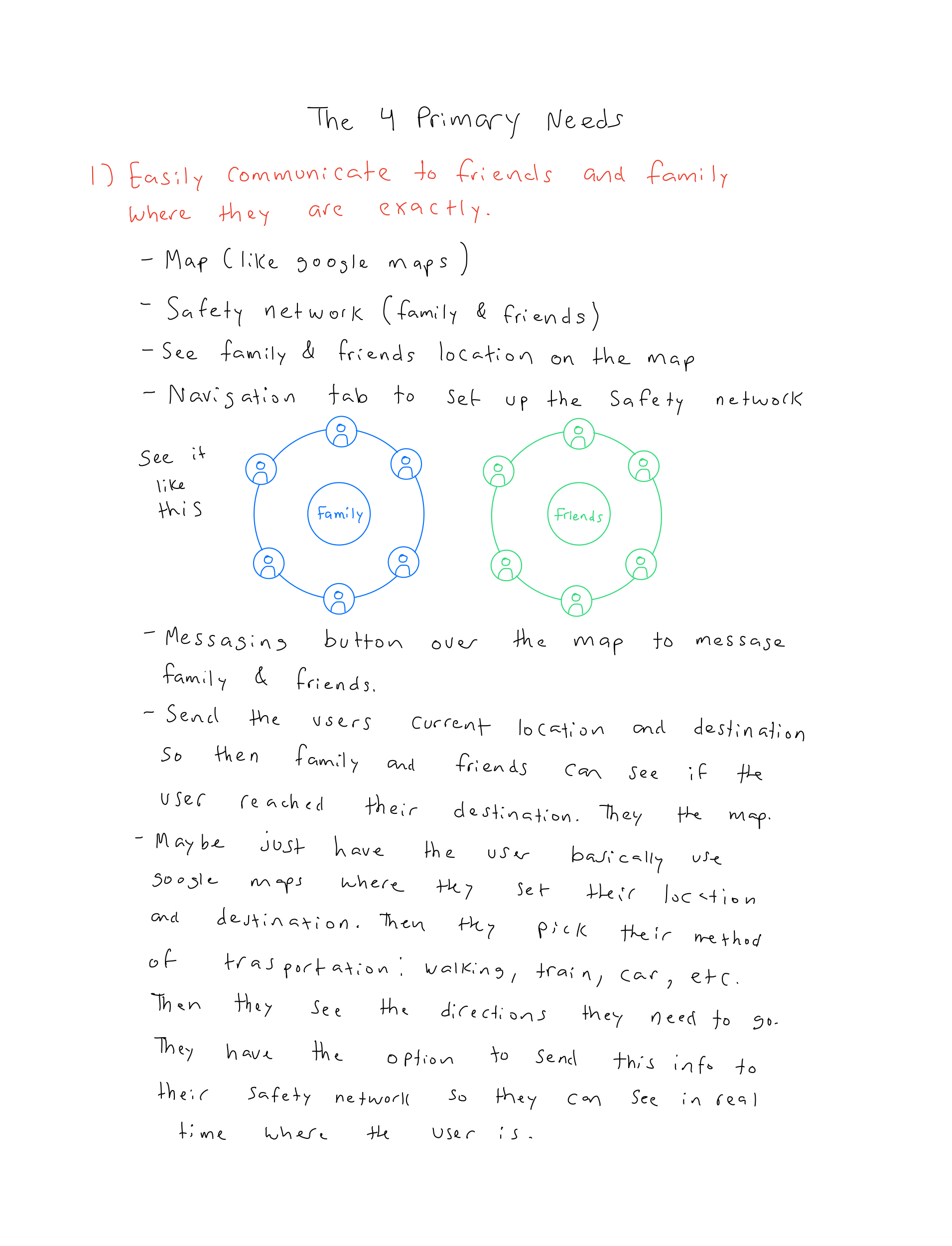
For the solution to effectively address the problem statement I found that these were The 4 Primary Needs for users:
Easily communicate to friends and family where they are exactly
A quick way to get/find help
Report for help if they are incapable of doing so
Educate themselves further of methods of protection
Ideate 💡
To get the ideas rolling I looked into the apps that were mentioned in my interviews that the interviewees had downloaded which were the Citizen App and Noonlight. But they stopped using them for these various reasons:
“The Citizen App just gave me a lot of anxiety due to just constantly seeing notifications of all sorts of danger happening. “
“The Citizens App just kept giving me notifications for situations that weren’t even near me.”
“I only got the Citizens App to just watch the crazy stuff happening on the live streams.”
“I deleted the Noonlight app since its only feature is to get help from family and emergency but since a situation never occurred I never used it so I deleted it.”
So I downloaded the two apps to see how they worked, if I’d share the same experience using these apps as my interviewees, and to see the features that both apps provide then break them down.
Brainstorming and Sketches
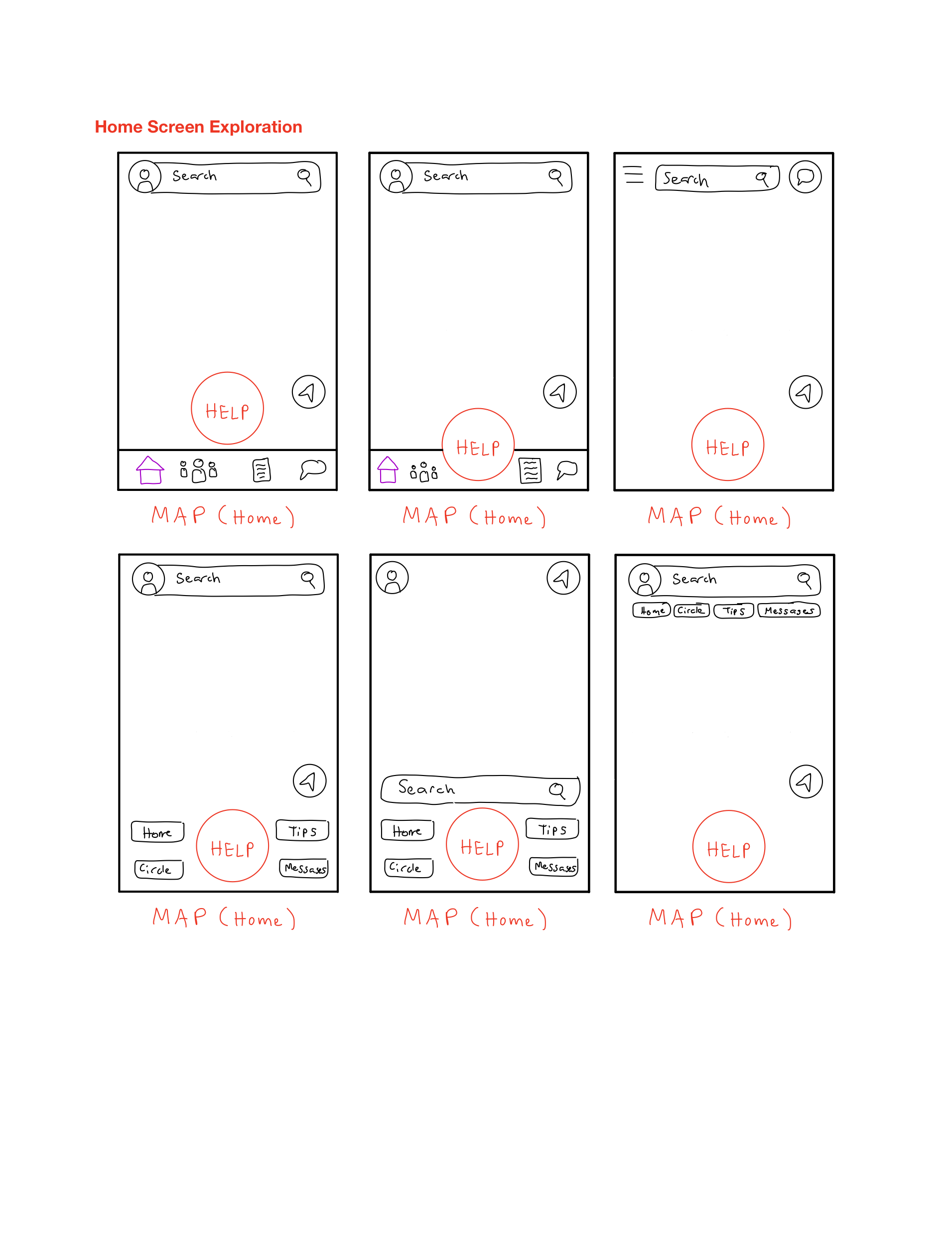
To get the ideas flowing on what features the app will have and how the design of it will look like, so I started brainstorming different ideas to tackle The 4 Primary Needs


Design 🎨
Digital Wireframes
I decided to delve into creating a medium-fidelity prototype to better explore how the app’s layout would function including the overall flow and to then use it to conduct testing to see what iterations will be needed to be made.
Some of the med-fid wireframes
Testing 🧪
With my functioning prototype all set and ready I conducted a series of remote usability tests with 5 participants. These were the main pieces of feedback I had received:
Participants didn’t like the change in the navigation UI when a destination was decided for the Map
The “Help” button was too big and took up too much of the screen
Have some form of customization when creating Close Circles
Know if the user you're adding into a circle has the app or not
Make sharing your route easier
Using the feedback I got from conducting usability testing I made the following iteration
New Bottom Navigation Bar
The New Bottom Navigation Bar now has a smaller “Help” button which takes up less of the screen and is less intrusive. When the user has finalized their destination and sees their route there will not be a new Navigation UI change but instead just maintains the same Bottom Navigation Bar throughout the app’s overall design.
New Sharing Route Process
In the med-fidelity prototype, I made sharing the user’s route a button in the old Navigation UI, but since people didn’t like the sudden change in Navigation UI this approach had to be altered entirely. So to make the flow easier for the users I made Sharing Route part of the route selection process.
New Circle Customization Process
As a suggestion from the feedback I got from the usability testing, I created a Circle Customization Process so when the user goes to the Close Circle navigation page they can create their first Circle and begin customizing it.
Changing adding contacts
When the user is adding contacts to the Circles they are creating they can easily see which one of their contacts has the app downloaded already and those who don’t. Those who don’t have the app downloaded will get a message telling them that the user added them to their circle and suggests downloading the app.
Final Concept 🎨
Visual Design
I created a style guide for myself that I can use throughout the app to maintain design consistency. The selection for Red is that it is associated with words like danger, warning, and power. The selection for Blue is that it is associated with words like freedom, calm, and trust. So as a whole the user will feel that they have power in their hands and can be calm in their travels by trusting the app with their protection.
The Solution
Onboarding and SOS Button Instructions
Here the user creates their account by first verifying their number, getting permission to use their location for the app, create a profile. and make a PIN. Once done they begin at the map screen and get instructions on how to use the SOS buttons and the purpose of their PIN.
Using the Map and SOS Button
On the map, if a Circle member shared their route with the user they can see where that member is going and their current location. The user can search their destination, verify it, select their mode of transportation, share their route with their circle, and follow the directions the app gives them. If they believe they are in danger they can tap and hold on to the SOS button for help. A 10-second countdown begins, prompting the user to enter their PIN to cancel the alarm if a false alarm. If 10 seconds have passed, emergency services and Circle members are contacted and shown the user’s current location. If the user would like to find a safe spot to go to they can tap on a Safe Spot and get directions to that location.
Creating Circles
Here the user can create their first circle and begin customizing by naming and choosing the color for the new Circle. The user then creates an additional Circle after the first one’s creation following a similar process but presses the + button to create a Circle.
Safety Tips Feed
Here the user can stay updated and educate themselves further with how to stay safe and better protect themselves. They can see the latest safety trends, new safety tips, videos, etc to prevent or prepare for the issues they may face to the best of their abilities.
Chats
Here the user can communicate with their Circle or Members of their circle as they are on their way to their destination. So if they share their route with their Circle or Member they can check in with the user to make sure they are safe.
Reflection
Working on this project was an interesting and rewarding experience and had its share of challenges. The main one is that the main users were women and as a man, I could never get the full scope of what they deal with on a daily basis so I spent a lot of time researching and empathizing with my interviewees. Since the time I was working on this project was when Midterms began it put many pauses in designing the app and made me jump into wireframing earlier than I wanted to. But I am genuinely happy with the outcome of this design solution and I learned a lot.
Next Steps
One feature that I had to scrap to save time was a journaling feature so the user can write about what happened that day and as they are traveling. They’d say where they went, who they met, describe people and places, events, etc. So when the user presses the SOS button those journal entries will be sent to the police to help them with their report to better aid the user.
Something I wanted to delve deeper into and showcase in the prototype was in check-ins. So Circle members who have the users route shared to them would get a notification from SafeSpot telling them something like “The user has not reached their destination in the estimated time of arrival” which would then make members check-in on the user to figure out what happened.
Further user testing on how users would like to be seen on the map and see how much more extensive it can get. Maybe users prefer having their location and route shown to all users and having a dedicated Ghost Mode button for example.
